Photoshop 5.x Type Tool
A D V E R T I S E M E N T
 The default type tool button allows you to create a new type layer. The second
button allows you to create a type mask. The third button is for a vertical type
layer, and the fourth is for a vertical type mask. You can toggle the four type
tools by pressing Shift-T to cycle through them.
To create an ordinary type
layer, you would select the type tool, then click once in your document to
invoke the Type tool dialog box. Before you click in your document, take a
moment to look at the I-beam cursor that appears when you move you mouse into
the document area:
 Notice the small horizontal line that intersects the I-beam. This line indicates
the
baseline of the type. It is useful for when you need to align the baseline
of your type with another object in your document, or for aligning type to a
guideline.
Now click in your document
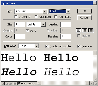
and we'll take a look at the Type Tool dialog box.

This dialog contains all
the options available for formatting your type. A preview of your type appears
in the bottom portion of the dialog box. The dialog box can be resized by
dragging on the edges. At the bottom of the dialog box, you have a checkbox for
Fit in Window. This causes the text in the dialog box to scale so all the
text fits in the dialog box preview. When this option is checked, the
magnification controls to the left are disabled. If you have more text than what
will fit in the preview area, and you want to view it at actual size, you will
have to uncheck the fit to window box and set the magnification to 100%. Then
you can use the scroll bars to view the text that falls outside the preview
area. When the Preview box is checked, you will also be able to preview
your text in the document window simultaneously.
| Notes
for Version 5.5 |
| In
Photoshop 5.5, you will have some additional options directly below the
font and style menus: Underline, Faux Bold, and Faux Italic. Underline
adds a line under your text. This is not available for vertical text.
Faux Bold and Faux Italics allow you to apply these simulated styles to
fonts that do not include these styles within the typeface. These
options are not available in Photoshop 5.0. |
The menus at the top of
the dialog box allow you to choose the font and style. If you're not sure what
font you want to use, you can highlight the text in the preview area, activate
the font menu, and use the arrow keys to browse all your available fonts. The
styles available will be dependent on the font selected. In my example, the font
selected was Courier, and I have applied a different style to each word. You can
change the formatting of individual words by dragging over them in the preview
area to select them, then changing options. The color option, however, will be
applied to the entire text layer and cannot be edited on an individual character
basis.
In the next section of the
dialog box, you have options for the size, color, alignment, kerning, leading,
tracking and baseline. You set the size of the type by entering a number in the
box. The default units are set to points, but you can change this to pixels
using the drop-down menu. To change the type color, click on the color swatch
and choose a new color from the color picker, or you can pick a color from your
document by moving the cursor outside of the color picker window while it is
open. The three buttons below the cancel button let you create left, centered,
or right aligned text. The rotate checkbox is only available for vertical text.
The baseline field lets you move individual letters above or below the baseline.
A positive number moves the characters above the baseline, and a negative number
moves characters below the baseline. Kerning, Leading and Tracking can be
explored on your own with the help of the User Guide, online help, or these
resources
from About's Desktop Publishing site.
Last of all, there's the
anti-aliasing options which we have already discussed, and a checkbox for
Fractional Widths (Photoshop 5.5 only). Factional Widths is enabled by default.
This option varies the spacing between characters to make it more readable. In
some instances-such as for small type to be displayed on-screen-you may get
better results by disabling this option.
|
